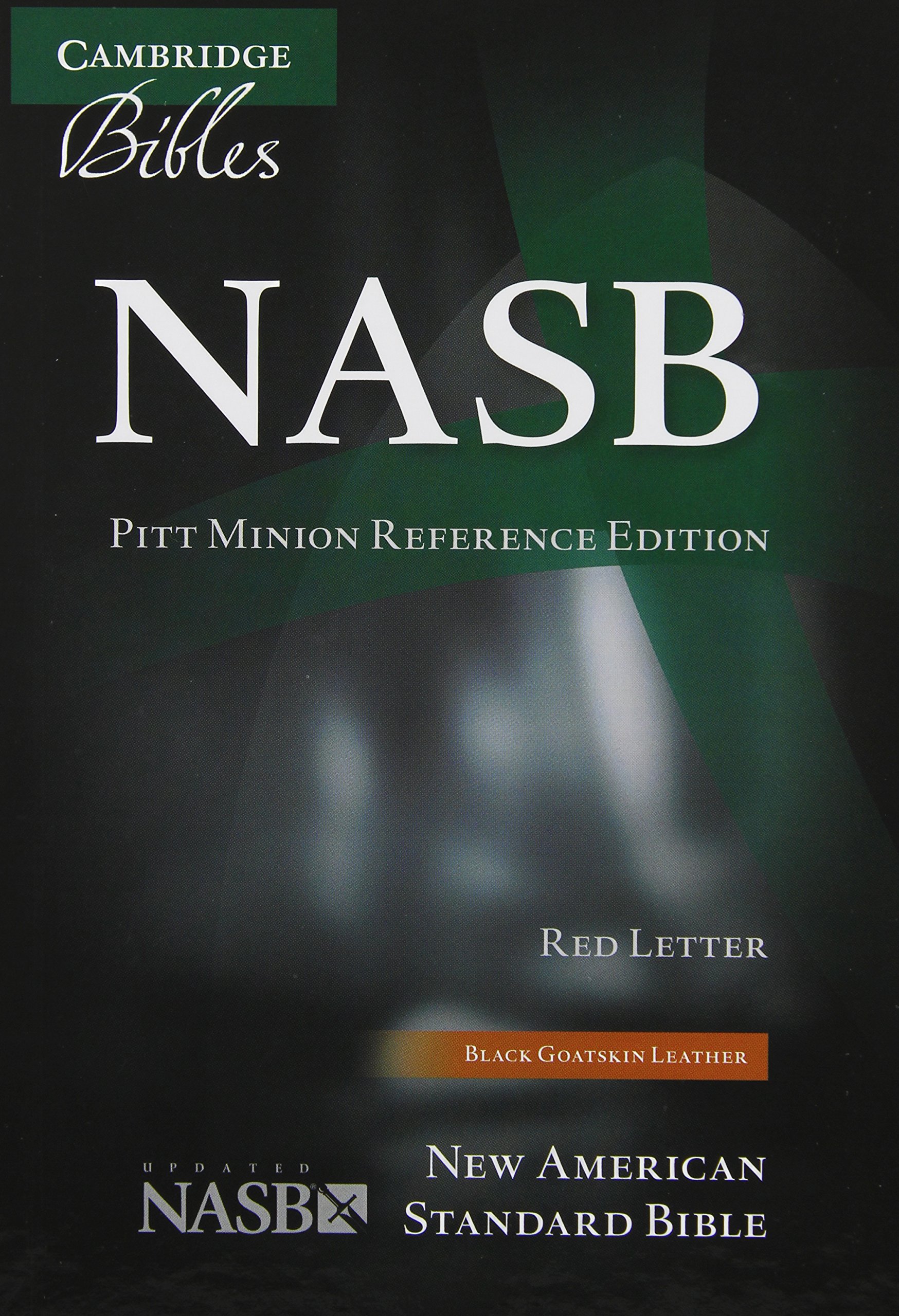
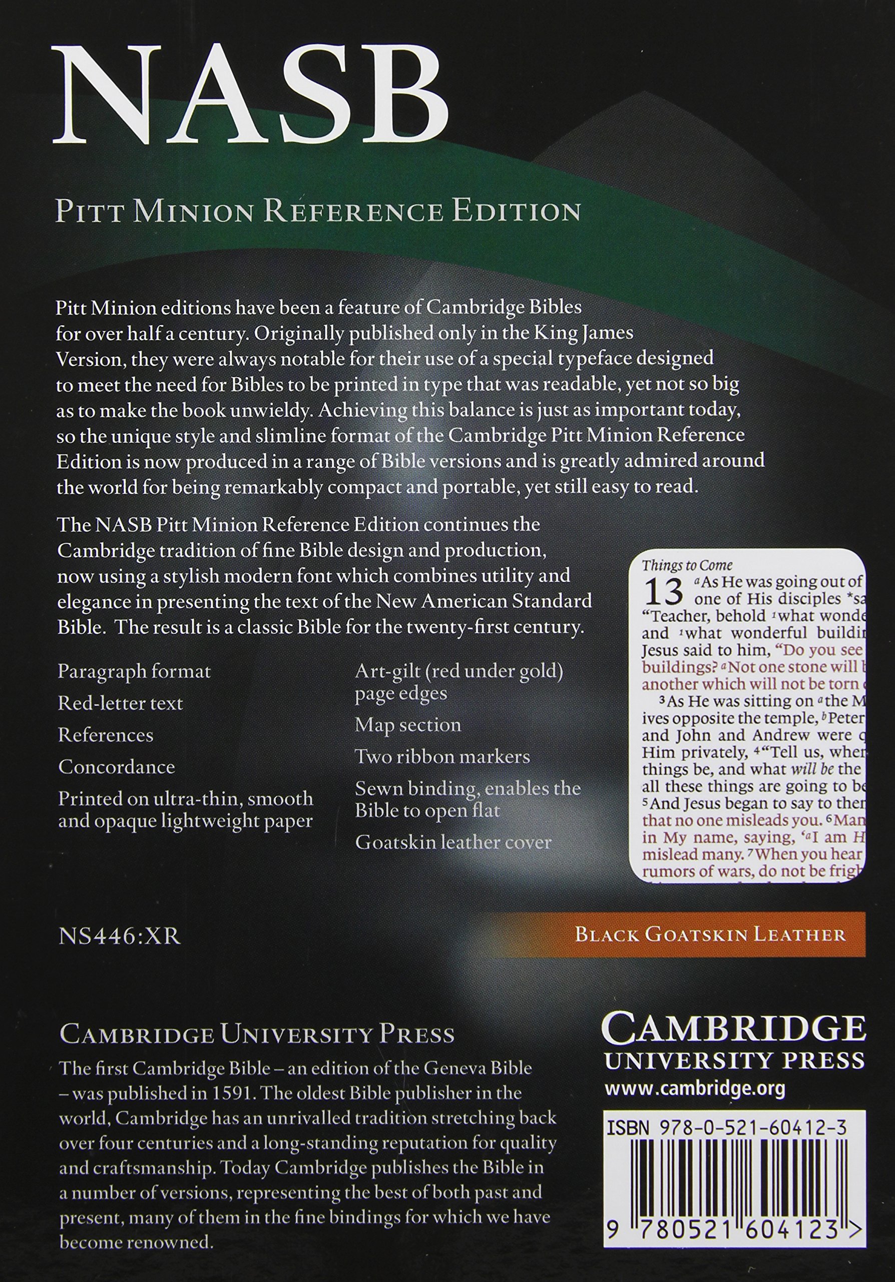

NASB Pitt Minion Reference Bible, Black Goatskin Leather, Red-letter Text, NS446:XR
O**T
This is by far the most beautiful Bible I have ever owned
I have purchased this Bible twice; the first one I gave away as a gift. This is by far the most beautiful Bible I have ever owned. It catches people's attention. It is the finest book I have ever held. The pages are top quality, and I do not doubt it will last a lifetime. There are still a couple minor points of improvement that could be made. First, the print is fairly small, and I expect to keep getting older, so there is concern that I will still be able to use it when I am very old. Interestingly, the print is exceptionally easy to read. So, I have put the font to the test reading in low light without my glasses (which hopefully represents the most blindness I will experience in life) and I can still read the print reasonably well. In normal lighting, even the footnotes and cross-references are very readable. The quality of the print is excellent to the degree that the size of the font may never matter. It is easy to read, but part of me still wishes it was a bit larger. Second, it is a double-column format which I do not prefer. I might be able to accept this better if the margins were equally wide. It has been noted that the inner margin is not as wide as the outer margin, and I do not intend on making fewer notes on the inner-margin verses. There is also a wide margin at the bottom of the page, which I tend to use for the inner-margin columns to make up for the space. You can create your own index of notes, and there are lined pages in the rear. All of this permits a high degree of flexibility for creating your own study Bible. There is a hardback version of this also, which runs about $50. I am using that as an opportunity to play around with the layout for notes, and planning to transfer to the goatskin Bible down the road. It may be worth noting that the NASB is scheduled to release an update in 2017, and hopefully the update will be released by Cambridge in a wide-margin format similar to this one....and who knows, maybe with a wider inner margin and a tad bit larger font. I do not necessarily expect a single column format since part of the purpose of this Bible is to preserve the Pitt Minion pagination. If you love the NASB, you will be very pleased to own this, with the only possible areas of concern being font size and that inner margin.
S**S
I love this Bible!
Update, 22 April 2017: WOW!!! I have now owned this Bible for over one year with HEAVY use. BEST BIBLE EVER!!!! Take a look at the pictures I uploaded. I have carried this thing all over the world and country. It is big for traveling with, but it has my notes in it!!! I have lugged it to India, Europe and countless states. It has probably logged more miles than most people ever will, lol! Not a single torn page, and the cover doesn't crease... no matter how many times I have rushed and thrown books in my backpack, crushing the cover completely in half for hours... NO CREASES! If you want a feel for dimensions, I included a photo with an iPhone 6, and with a normal 8.5 x 11 piece of copy paper.I adore this Bible. I have wanted this quality level of Bible since I graduated Bible school. This book does not disappoint. I am a notetaker and this Bible is perfect... amazing supple feel and construction. It is the most "flexible" Bible I have ever owned... and I have owned a LOT. The leather is unlike any Bible I have known! It almost feels alive, not dead and stiff. Leather is on the outside and inside of each cover. The pages are durable, yet so thin and beautiful. I can't say enough good. I have been using it for months and slug it around (it's big) all over the world with me. I love marking it up and creating my very own cross reference guide. This Bible is built to pass on to your kids. It really is an heirloom.
T**D
THE best quality NASB on the market!
This is by far the best quality Bible you will find. If you are looking for a Bible to last the rest of your lifetime and are tired of poor bindings that don't hold up, you won't be disappointed w/ this one. I used a Thompson's chain reference study bible before this one, and they just aren't made as well as they used to be, and after just 4 years I was already unhappy w/ the wear mine had received.Reasons I love this Bible:- Goatskin leather cover- you can't get any better than this!- Smyth Sewn binding- this is THE best binding available- Quality pages- thick enough you can write on them w/ out bleed through- Wide margins- wider than I was used to, but now I love having the extra space to write in notes.- LOTS of blank pages at the back to write in extra notes or outlines, and even an alphabetized section to make your notes easier to find when you need them.- Smaller NASB Pitt Minion Reference Black Goatskin NS446XR also available w/ the same page printings but in a little bible, so when you need to bring a small Bible w/ you, you can use the Pitt instead, but the verses are still located in the same spot on the page as what you're used to in this one.By the way, I highly recommend using the Pigma Micron pens to write in this Bible, they are archival ink and won't feather/bleed/fade over time. I also recommend NOT using highlighters, but getting a nice set of colored pencils for underliningAmazon won't let me give outside links in the review, but on my website (which you can find on my profile), I have helpful resources and a great article for those in search of a good quality Bible (on the "Growing Christian" page).Happy Bible shopping!
B**R
The cover is so nice
The inside is tenets part, but the cover sure makes you want to hold onto it
M**E
Best mainstream Bible available
I was a long time NIV user and finally got tired of the inaccuracies and abominable paraphrases which cast doubt upon the Word of God. I needed a more literal Bible. After much searching, I finally decided upon the NASB, which is by far the most literal mainstream modern Bible available. It is marketed as the most literal Bible, but it is not more literal than the King James Version. What the NASB consistently puts in the margin will usually be in the main body of text in the King James Version. It is definitely the most literal modern version however.The NASB is an option which doesn't get that much publicity - I think putting, "American" in the title puts off non-Americans. I was extremely glad I went for the NASB though. It is very literal and when it does divert from the text, it puts the literal Hebrew or Greek in the margin. It is very easy to read, has very little, "Biblish" which is what is found in other formal equivalent (word-for-word) translations, has in capitals references to other verses and has a decent margin as well! Asterixes are put next to words in the New Testament which are past tense in English but present tense in the Greek.The Old Testament is based on the Masoretic Text but the translators also consulted the Dead Sea Scrolls and the Septuagint. The New Testament is based on the Alexandrian Texts. If you Byzantine Text supporter, most (but certainly not all) of the passages which would be "missing" in a Alexandrian text Bible are included in brackets in this Bible.The paper is reasonably thick, the leather is beautiful, there are lots of pages at the back to write notes in and there is a great concordance at the back as well - I find it hard to imagine a better Bible.Minor negative points are the strong theological bias in the sub-headings of paragraphs e.g. John 1's is, "The Deity of Christ" and Revelation 12's is, "The Man-child, Christ." Words of Christ are in red with no explanation why.Aside from these minor issues, it is an absolutely magnificent Bible.
A**R
I love to
I love this bible
D**L
Fantastic Bible, if you like small Bibles with small ...
Fantastic Bible, if you like small Bibles with small print. Very readable though for such small print, crisp, good paper, beautiful construction and an incredible deal from Baker Publishing Group, practically half price. Will definitely order through them again, and yes I recommend the Pitt Minion!EDIT**I've had this Bible for a couple of years now, it's not used every single day but very regularly, definitely a few times a week and it's also usually my travel Bible. It has held up very well, it's broken in nicely, flops open and stays there. Again, very readable for such small print, it's line matched which helps a lot. It takes a Pigma Micron 005 pen very nicely.Something I didn't mention is the maps. Cambridge owns with this, 15 maps with a very extensive map index. I have study Bibles that don't even have map indexes, Cambridge does this very very well. I would buy this again if I went back in time for sure. I'm confident the calf split would hold up just the same.Highly recommend.
S**S
a perfect choice for eagle eyed readers, blemished perfection for the rest of us!
This is SUCH a beautiful book, pretty close to perfection, except for one (serious) flaw, of which, more later.The binding is quite wonderful, a smooth supple, almost flowing goatskin (a pity it's not leather lined) which opens very flat through most of the text block, though needing a little breaking in at the very beginning and end. The art gilding on my copy is flawless, a beautiful, highly reflective gold when looked at directly, but modulating into the subtlest, almost salmon pink red as the text lies open. The concordance is very extensive and thorough, the map index quite exceptional and the maps themselves exemplary. for those wishing to compile an indexed set of study notes, there are alphabetised lined sheets at the back with other lined sheets for note-taking. The note paper is sturdy without destroying the practical elegance of the volume. as for the paper used for the printed text itself, it is superb, slightly off-white and creamy which sets of the print beautifully. it is also a heavier weight as is appropriate for a bible designed for writing in. I have NO doubt that this could easily be achieved with appropriate pens, pencils and highlighters without bleed through, tearing or excessive ghosting on reverse pages. Print ghosting is visible, but the text is so well line-matched and the paper of such opacity that it really isn't a problem. The margins are generous for annotation, without being so extensive as to make the page look unbalanced and rather ridiculous for readers who would NEVER bring themselves to write in such a lovely book.I LOVE it!So why am I returning it?With real reluctance and accepting the reality of things, I know I would hardly ever use it, simply because the text is just too small. The text is an expanded version of the, to me, absurdly small font used in the Pitt Minion series. but it has been expanded to just 8pt with an 8pt lead in (ie the size of the space between the printed lines). Maybe with a 10 pt lead in the 8pt text would be more acceptable. for me, if the text was 8.5 font with a 10.5 lead in like the Clarion series, there would be no way I would part with this almost PERFECT edition.All I know is that after 10 minutes reading, not exactly the sort of study period one would think typical for users of a wide margin bible, I was exhausted and reaching for my magnifying glasses which i use in print making, which in themselves do not make for a comfortable reading experience of any duration. What is even worse is that the references and footnotes are in a font which is even smaller, pretty catastrophic in a wide margin bible because a disinsentive to exploring the text fully, one of the particular attractions of the NASB. (It's also a great pity Cambridge doesn't adopt the approach of Schuyler, where footnotes (translation notes etc) and references are separated. I found it intensely frustrating to have to wrestle with the tiny reference font as well as disentangling the textual notes from references. And I should make clear that though my eyesight is far from perfect my reading glasses deal with most things pretty completely.This is SUCH a disappointment. Like finding the perfect house ..... in the central reservation of a motorway.I know larger fonts could mean narrower margins and/or more pages and other issues relating to book size, but I would be very curious to know how much bigger the text block would have had to be to bump up the font to 8.5 and making the lead in equal, or just a little bigger.So....... i cannot give such near perfection less than 3*, nor can I give it 5* because it is unsuitable for the everagely eyed user that is me!. So 4*.
Trustpilot
1 day ago
1 week ago
