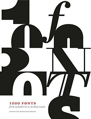


Full description not available
N**N
Excellent to have so many interesting fonts contained in on ...
Excellent to have so many interesting fonts contained in on place. Sectioned in terms of style and with descriptive panels
D**K
Font of wisdom.
As comprehensive as it comes.Wonderful! Thank you.
W**R
Four Stars
I guess I need a book called 5000 fonts
E**E
Oddly sloppy, but a useful reference
This is a useful reference, with 1,000 typefaces covering the usual categories: serif, sans-serif, display, script etc. I don't know of another book with this good a range of typefaces. It makes typeface identification possible if not easy (compared to say FontFont's vast typeface bible). But it could have been so much better. Each typeface has a reasonably large size full alphabet in caps/lowercase/numbers and then 2 or more text samples in a couple of weights. All very well, except that the alphabet sample is not always in a sensible font e.g. Gotham is in Ultra, which makes identification of the more normal weights a bit haphazard. Many typefaces do not benefit in the slightest from text samples, particularly the Display section, but the compilers clearly felt constrained by the book format rather than varying it sensibly to make best use of space (e.g. for Display typefaces dispensing with the text sample and having a couple of larger size Display samples). Most bizarre are the scarce samples of "real world" usage. Gotham again: a tiny copy of a poster which has no discernible use of Gotham; many samples where the text is so small that it is useless as an example of the typeface. I don't regret buying this, but what a shame the compilers could not have put a bit more thought and care into it.
N**N
I don't know that, on my travels, I encountered a book that rivals this for the subject of fonts, typography and design.
The first thing that I realised, on my first ever visit to the Graphic Design section of a bookshop with the intended purpose of looking for typography books, was that every book is not only different but different furthermore for the intended user. While for me, in this very moment for my intended purpose, this book is perfect for someone else it might be further away from what they're after. I'd say take a look in person, in a shop, at the range of books that typography has to offer and then decide what outlet to use to purchase that volume. I'd advise Waterstones, the bigger stores, as a place to check out books in persons before buying online or in the shop. I'd say with things like this you need to check them out before investing because ultimately, the way I see it, typography books are the ones that are going to last the longest and form just one brick amongst the foundations of every project that hereon follows.The purpose of this book is vast, much like the fonts it contains, and to me, although more edition may later be added, I'd consider this, for now, all you need to not only get you started but to keep you going for a while. The sections of fonts that it contains are, in order, as follows: Serif, Sans Serif, Display, Script, Billboard and poster, Mono-spaced, Screen and web, Inline and stencil, Ornament, Symbols and dingbats, Fun and illustrative. Each section title page has a coloured page but is not easily distinguishable from the others since, despite most font pages are white, some have a coloured background (or designs on that overlap the edge of the map thus creating a coloured impression when looking at all the pages together with the book closed). I'd probably put some small pieces of paper or whatever your preference suits to mark out the section pages for future reference since the book contains no contents page.The back pages contain a: description of various designers (24 designers in total), glossary (spans four pages), resources (spans two pages), font index (spans four pages - in a slightly confusing order) and acknowledgements (one page, the last of the book). I'd like to highlight that even on the resources page, of which contains links to web pages, handy as it is it doesn't state the license conditions for each font and so research is still needed to be done if you intend to use the fonts for a commercial purpose.The resource page, in my print version, contains eighteen websites. The resource page also has a list of nine other recommend books for the same purpose of typography.I think the symbols and ornaments section at the back of the book are useful because I know some authors or self-publishers like to include such material in the design of their pages. Not only that but some books, costing £15 upwards, are designed with ornaments as their main and only subject and so I'd at least look at this, in person, before buying one of those books, if that's what you're specifically after, just to see if this has what you want considering this book could act as both a design, in brief, guide and font guide.The quality of the paper feels nice and the weight of the book isn't too much. You could probably easily carry this from one location to another.I think one downside, for the serif section at least sine that's where my focus is at the moment of the review, is that font sizes samples are 8/10 or similar where I'm most concerned with 12 pt. While it's not hard to gauge if you want to go bigger or stay at 10 pt I'd question who uses 8 pt for purpose of print (not that that's the only purpose of this book). Maybe its a decision that, over the entire book, stopped it becoming £24 rather than £14, for example, but is something to be aware of. Would have been nice for font samples to have been written with actual words rather than internet jargon (lorem ipsum - the standard text filling for blank word boxes that's used by designers before content is added). I realise to do so would have complicated the book hugely but we write in words not lorem ipsum and so are the font samples really of much use to gain a true sense of how words will look in our projects when you think about the random combinations that lorem ipsum throws up that, in actual real world use, would never come about because words are spelt with such combinations. I think you have to overlook the words and focus on the features, size and alike. Again, something to note (there's always going to be faults in every book, don't think of my here mentioned faults as defining buying topics). May I, finally, also point out that you're not going to find every font you desire in this volume.I like it. I'm glad it exists. It was the only book that, upon going to the bookshop, I didn't want to leave without. I almost paid full price, a rare thing for me, but found it cheaper online and waited. Bears no real input on the review but it's one of those books that, for all the effort it must have took to put into print, is worth the asking price. I don't know that, on my travels, I encountered a book that rivals this for the subject of fonts, typography and design. The bible of font books?I couldn't be happier to own it. All that's left is to make use of it.
Trustpilot
1 week ago
1 month ago
